
CSS Grid is a powerful layout system that has transformed the way web designers structure and style websites. It provides a flexible, two-dimensional grid-based approach, making it easier to create complex layouts without the need for excessive code or tricky workarounds.
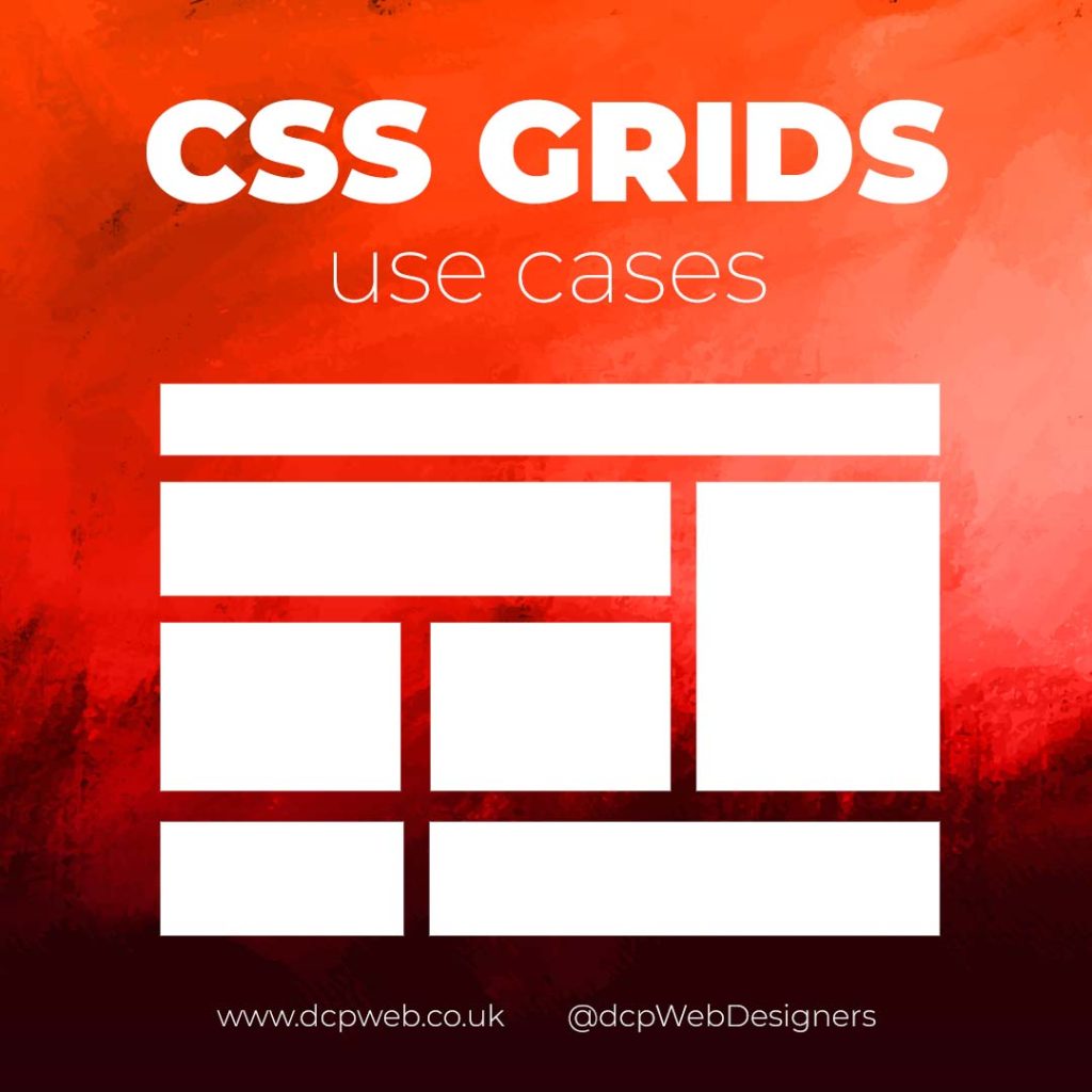
In this infographic blog post, we’ll explore four practical use cases for CSS Grids that can elevate your web design projects.
Building Stunning Image Galleries
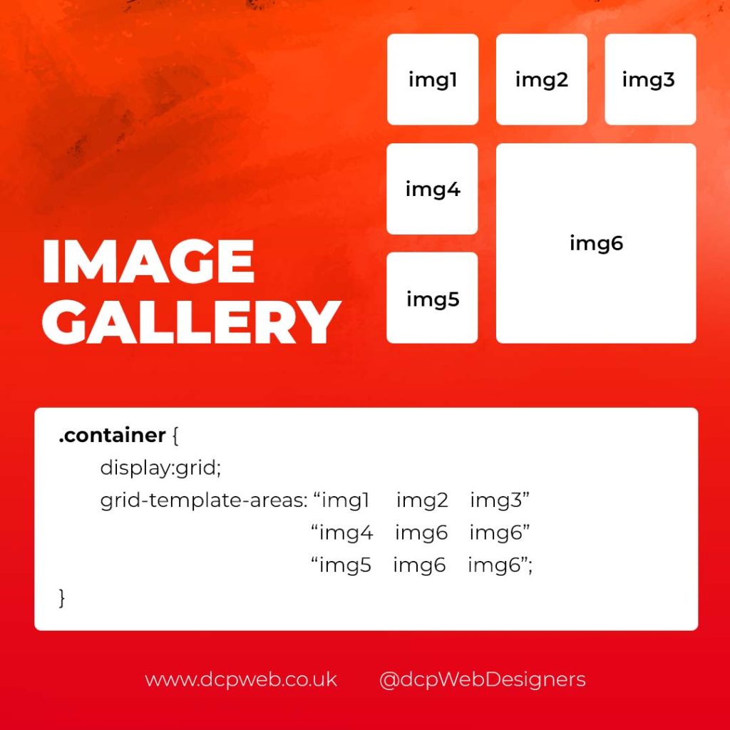
Image galleries are a staple in modern web design, and CSS Grid is an ideal tool for creating them. Unlike traditional layout methods, CSS Grid allows you to define precise rows and columns, making it easy to align images without breaking the overall design.
Why Use CSS Grid for Image Galleries?
- Flexible Layouts: Easily control the number of columns and rows based on screen size.
- Gap Control: Use the grid-gap or gap property for perfect spacing.
- Responsive Design: Adjust column sizes and row heights without breaking the layout.
- Layering and Positioning: Position images in creative ways, including overlapping elements.
Basic Image Gallery Example
<div class=”gallery”>
<img src=”image1.jpg” alt=”Image 1″>
<img src=”image2.jpg” alt=”Image 2″>
<img src=”image3.jpg” alt=”Image 3″>
<img src=”image4.jpg” alt=”Image 4″>
<img src=”image5.jpg” alt=”Image 5″>
</div>
.gallery {
display: grid;
grid-template-columns: repeat(auto-fill, minmax(200px, 1fr));
gap: 16px;
}
.gallery img {
width: 100%;
display: block;
border-radius: 8px;
Advanced Image Gallery Layouts
Experienced web designers can also create more intricate layouts by spanning images across multiple rows or columns using the grid-column and grid-row properties, giving your galleries a more dynamic and polished look.
Creating Main Website Layouts
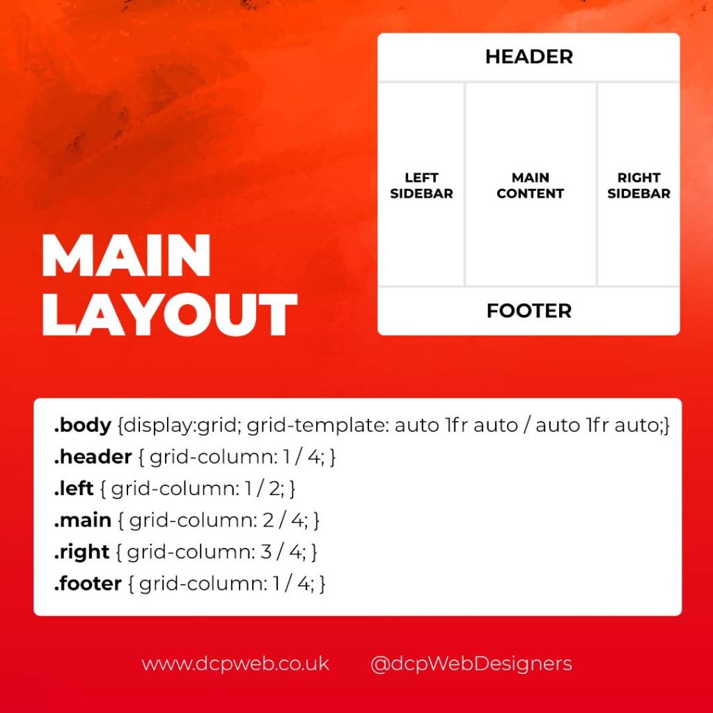
CSS Grid shines when it comes to designing the main structure of a website. Whether you’re building a blog, portfolio, or business website, grids provide the framework for responsive and organised layouts.
Why Use CSS Grid for Main Layouts?
- Clear Structure: Define headers, sidebars, content areas, and footers precisely.
- Responsive Design: Create layouts that adapt effortlessly to different screen sizes.
- Efficient Code: Reduce the need for excessive wrapper divs and floats.
- Complex Designs: Easily create overlapping sections and layered effects.
Basic Main Layout Example
<div class=”main-layout”>
<header>Header</header>
<nav>Navigation</nav>
<main>Main Content</main>
<aside>Sidebar</aside>
<footer>Footer</footer>
</div>
.main-layout {
display: grid;
grid-template-areas:
“header header header”
“nav main sidebar”
“footer footer footer”;
grid-template-columns: 1fr 2fr 1fr;
gap: 20px;
}
header { grid-area: header; }
nav { grid-area: nav; }
main { grid-area: main; }
aside { grid-area: sidebar; }
footer { grid-area: footer; }
Advanced Main Layouts
For more complex designs, consider using CSS Grid in combination with Flexbox for greater flexibility and control over nested elements.
Designing Attention-Grabbing Banners
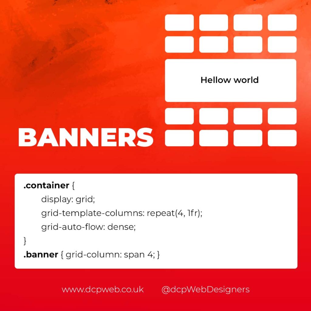
Banners are crucial for grabbing user attention, and CSS Grid makes it easy to create stunning, multi-layered designs without relying on complex positioning hacks.
Why Use CSS Grid for Banners?
- Flexible Positioning: Easily place text, images, and buttons exactly where you want them.
- Responsive Design: Maintain structure across different devices.
- Layer Control: Use grid layers to create engaging, multi-dimensional designs.
Basic Banner Example
<div class=”banner”>
<div class=”overlay”></div>
<h1>Welcome to Our Website</h1>
<p>Discover our range of services.</p>
<button>Learn More</button>
</div>
.banner {
display: grid;
grid-template-areas: “overlay”;
position: relative;
background-image: url(‘banner.jpg’);
background-size: cover;
background-position: center;
height: 300px;
color: #fff;
text-align: center;
}
.overlay {
grid-area: overlay;
background-color: rgba(0, 0, 0, 0.6);
position: absolute;
top: 0;
left: 0;
right: 0;
bottom: 0;
z-index: 1;
}
.banner h1, .banner p, .banner button {
position: relative;
z-index: 2;
}
Perfectly Centring Items
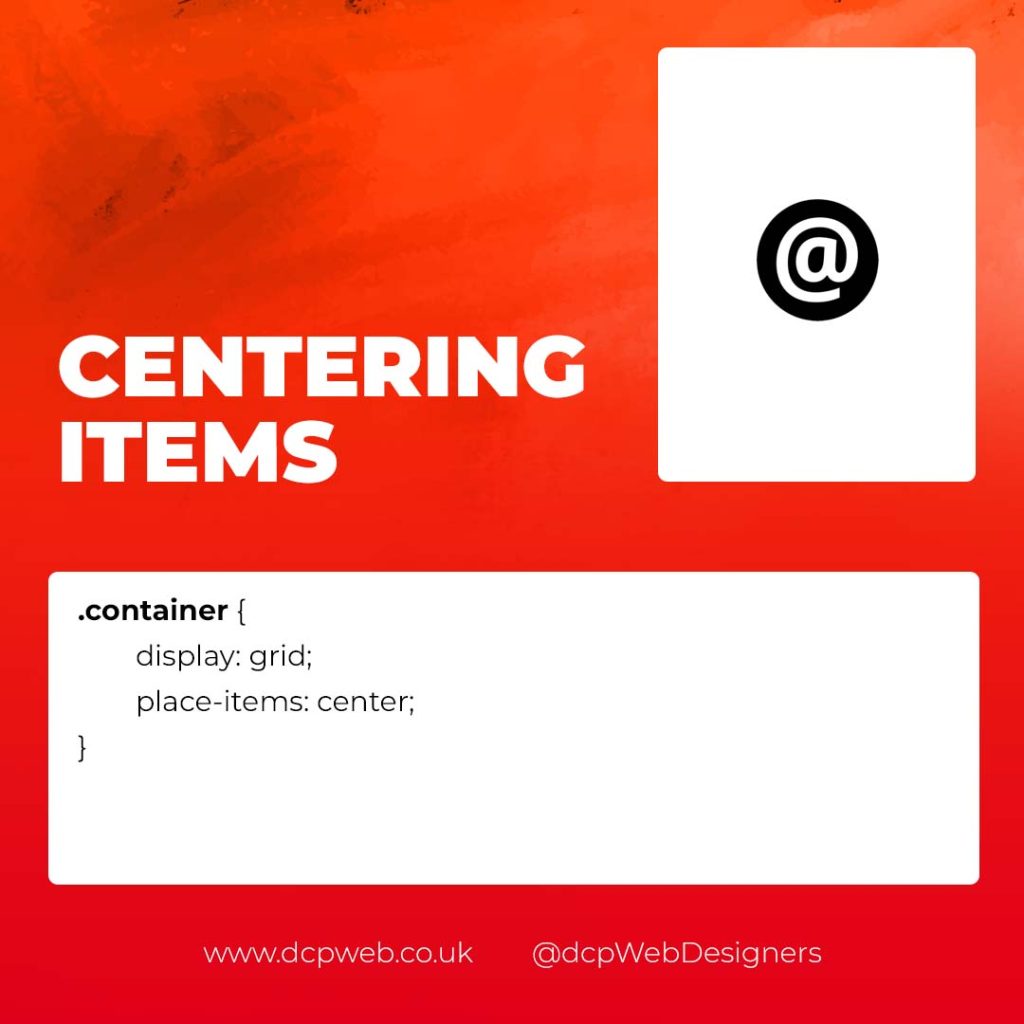
Centred layouts are a common design choice, and CSS Grid provides a simple way to centre content without relying on margin hacks or flexbox tricks.
Why Use CSS Grid for Centring?
- Simplicity: One line of code can achieve perfect centring.
- Cross-Browser Support: Reliable centring across all major browsers.
- Versatility: Works for both single items and entire sections.
Basic Centring Example
<div class=”centre”>
<h2>Centred Content</h2>
</div>
.centre {
display: grid;
place-items: center;
height: 300px;
background-color: #f4f4f4;
}
Conclusion
CSS Grid is an incredibly versatile tool that can streamline your web design workflow, reduce code complexity, and enhance the overall user experience.
Whether you’re building image galleries, main layouts, banners, or perfectly centred designs, CSS Grid offers a flexible and powerful solution.
Experiment with these practical use cases to unlock the full potential of CSS Grid in your projects.