
At DCP Web Designers, we understand that readability is fundamental to great website design. No matter how compelling your content is, if your audience struggles to read it, they will quickly leave your site.
By focusing on readability, you can deliver a better user experience, improve engagement, and help visitors find the information they need more efficiently.
In this blog post, we explore four essential tips for creating easy to read web content. These include using strong contrast, choosing the right font size, selecting a simple typeface, and limiting the number of fonts used on each page.

Why Readability Matters in Web Design
When visitors land on your website, they scan the content quickly to determine if it’s worth reading. Poor readability can frustrate users and increase bounce rates, which negatively affects your SEO rankings. Making your content accessible and easy to read shows professionalism and keeps users engaged longer.
Key benefits of improved readability include:
Enhanced user experience across all devices
Increased content retention and clarity
Improved accessibility for users with visual impairments
Stronger brand perception and credibility
At DCP Web Designers, we build websites with user-centric design principles that prioritise both function and readability.
Contrast is key
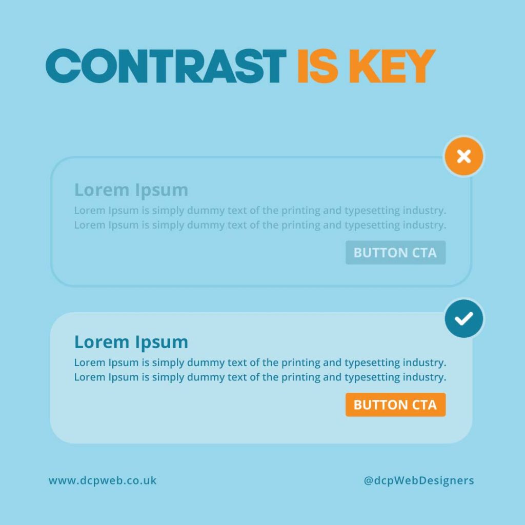
Good contrast between text and background is one of the most important aspects of web readability. Without proper contrast, text can become difficult to distinguish, especially for users with visual impairments. High contrast ensures that your content is clear and easy to read for everyone.
Here are some best practices to follow:
Use dark text on a light background or vice versa
Avoid similar hues such as light grey text on a white background
Test your colour choices with contrast-checking tools
Follow WCAG 2.1 guidelines for accessibility
At DCP Web Designers, we incorporate strong contrast techniques into all our web design projects to improve visual clarity and usability.
Use large letter size
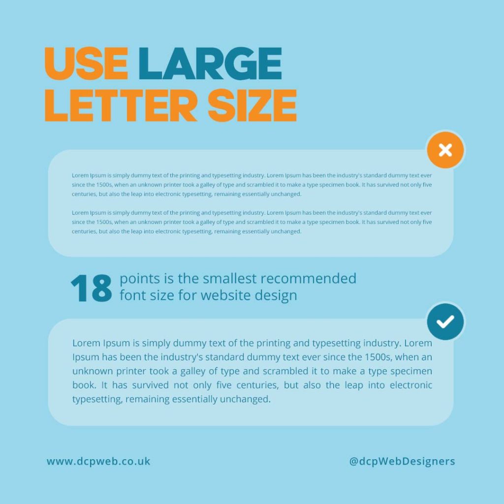
Font size plays a crucial role in making web content legible. Text that is too small can strain the eyes, while oversized text may look unprofessional or disrupt layout structure. Striking the right balance is key to creating a pleasant reading experience.
Recommended font sizing tips:
Use a minimum of 16px for body text
Increase heading sizes progressively (e.g. H1 > H2 > H3)
Ensure font sizes scale well on mobile and tablet screens
Use relative units like rem or em for flexibility in responsive design
At DCP Web Designers, we ensure that all our websites maintain optimal font sizes across devices to improve readability and accessibility.
Choose simple typeface
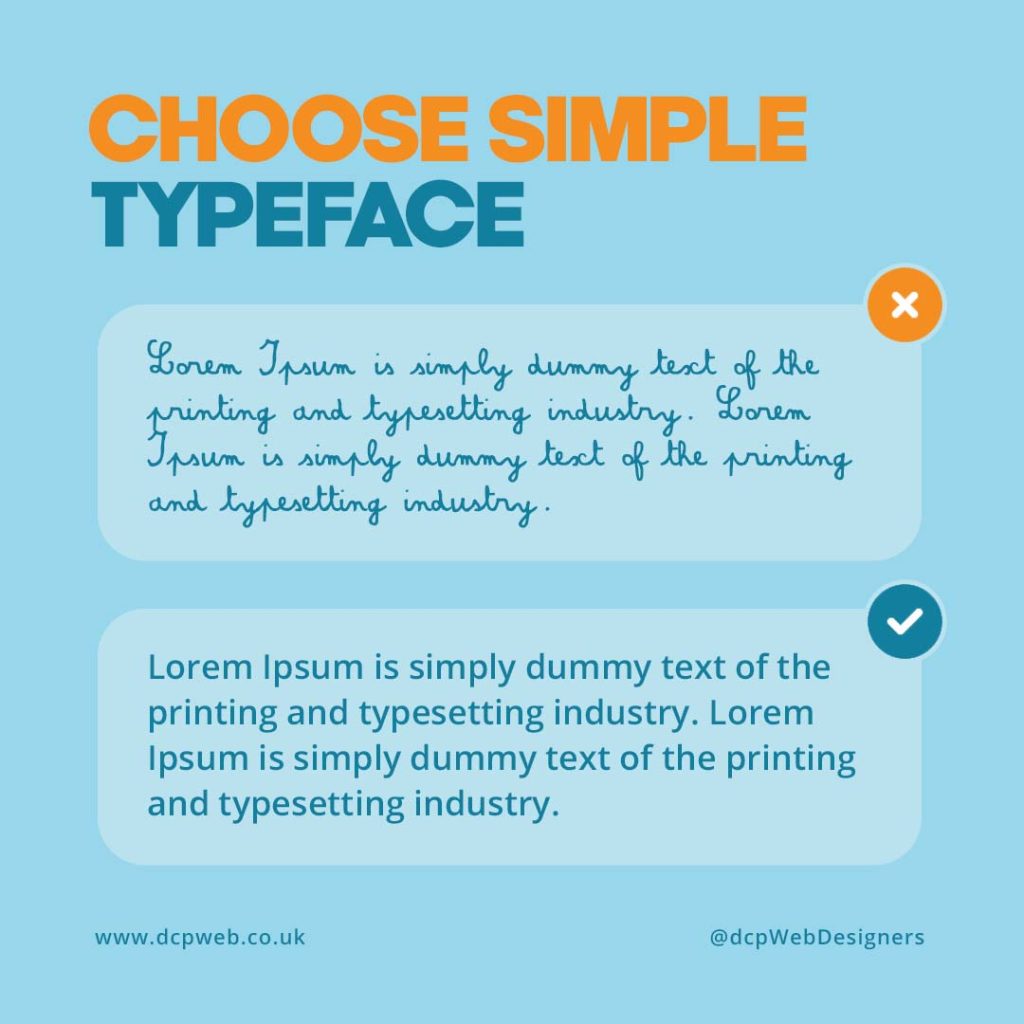
Complex fonts may look stylish, but they often reduce readability, especially on smaller screens. A clean, simple typeface improves user comprehension and makes the content easier to digest. Avoid decorative or script fonts for body text, and reserve them for branding elements if necessary.
Best practices when choosing a typeface:
Opt for sans-serif fonts like Arial, Helvetica, or Open Sans
Avoid over-stylised fonts in paragraph text
Ensure the font has good spacing and clear letterforms
Test the typeface across various screen resolutions
At DCP, we carefully select typefaces that offer clarity, consistency, and a professional appearance.
Limit the number of fonts
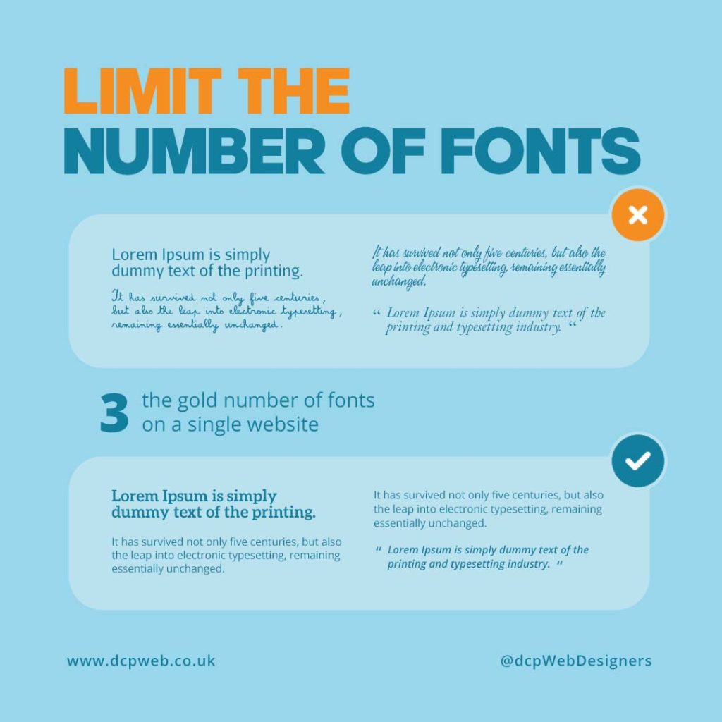
Using too many fonts on a single web page can be visually overwhelming and disrupt the user experience. Limiting font usage improves visual consistency and creates a more cohesive design. A clean, unified typography system helps users navigate your content more easily.
Font usage tips for your website:
Stick to one or two complementary fonts
Use a single font for body text and another for headings, if needed
Maintain consistent line spacing and font weight
Use font pairing tools to test combinations before implementation
We ensure that font combinations are minimal, aesthetically pleasing, and aligned with your brand identity.
Final Thoughts on Readable Web Content
Readability is a foundational component of any successful website. From font size and typeface to contrast and font usage, small design decisions have a big impact on user satisfaction. By keeping your web content clear and accessible, you improve engagement and support better SEO performance.
To summarise:
-
Focus on strong text-to-background contrast
-
Use legible font sizes suitable for all devices
-
Choose clean, readable typefaces
-
Limit your font selection for consistency
Our web designers build custom websites that combine aesthetic appeal with functionality. Our goal is to help your business communicate effectively through well-crafted, readable web content.
Explore our Web Design Portfolio or learn more on our Custom Website Design page.