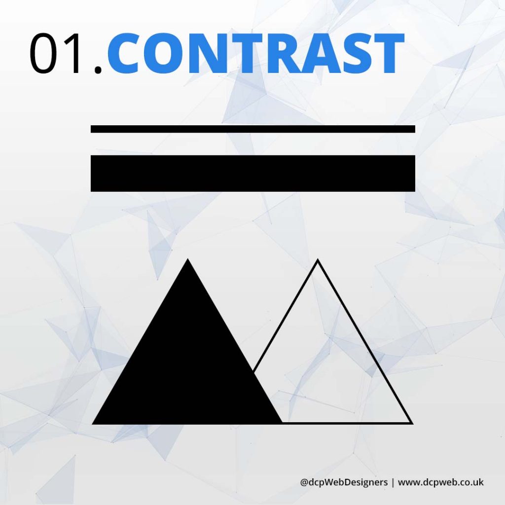
Contrast enhances visual interest by making elements stand out. It improves readability, creates hierarchy, guides attention, and adds depth. Strong contrast ensures clarity, making designs more engaging, accessible, and aesthetically appealing.
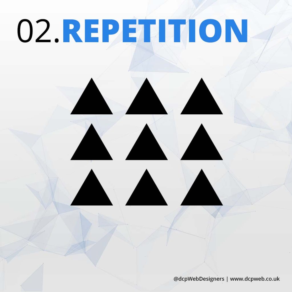
02. Repetition
Repetition reinforces consistency by using recurring elements like colours, fonts, and patterns. It enhances brand identity, strengthens visual cohesion, improves user experience, and creates a sense of unity in design.
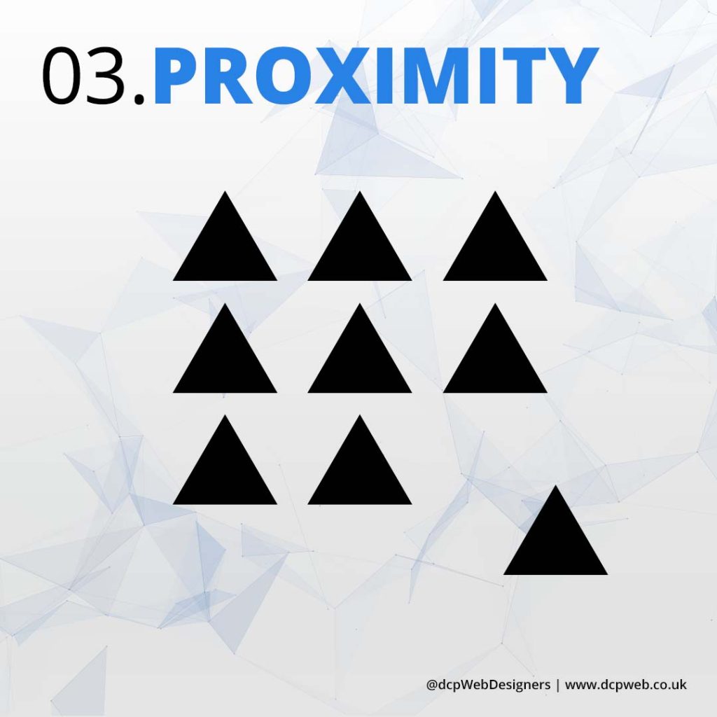
03. Proximity
Proximity groups related elements together, improving organisation and readability. It enhances visual hierarchy, reduces clutter, strengthens relationships between elements, and guides users’ focus, creating a cleaner, more intuitive, and effective design.
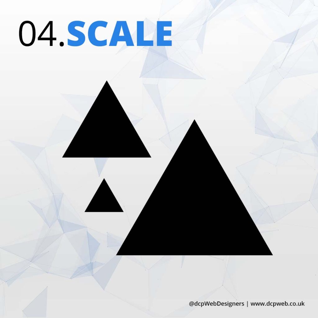
04. Scale
Scale enhances visual hierarchy by adjusting element sizes to indicate importance. It guides attention, creates emphasis, adds depth, and improves readability, making designs more dynamic, engaging, and easy to navigate.
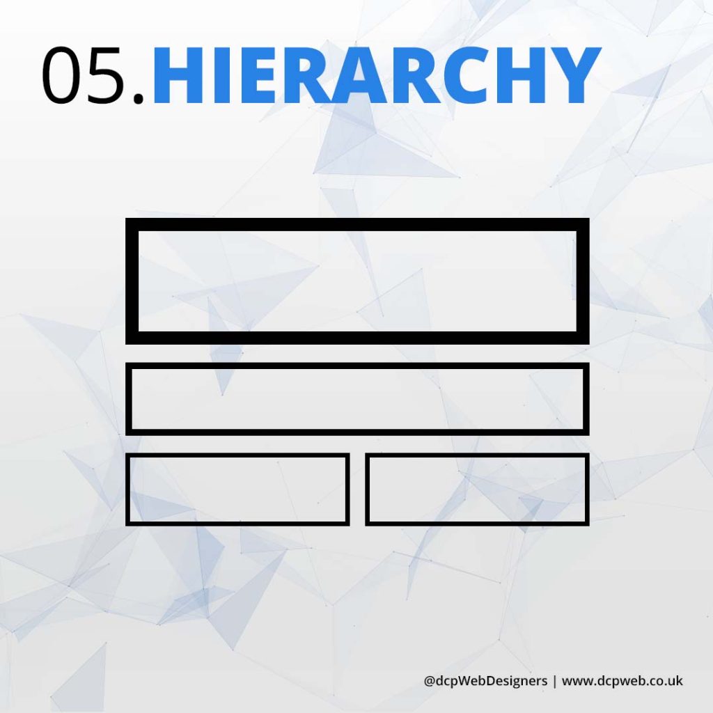
05. Hierarchy
Hierarchy organises design elements to guide the viewer’s attention. It improves readability, prioritises information, enhances user experience, and ensures a clear visual flow, making content easier to understand and navigate effectively.
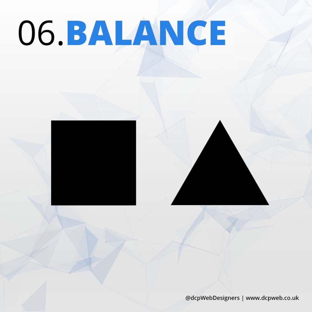
06. Balance
Balance creates visual stability by distributing elements evenly. It enhances aesthetics, improves readability, ensures harmony, and provides a structured layout, making designs feel more organised, professional, and visually appealing.
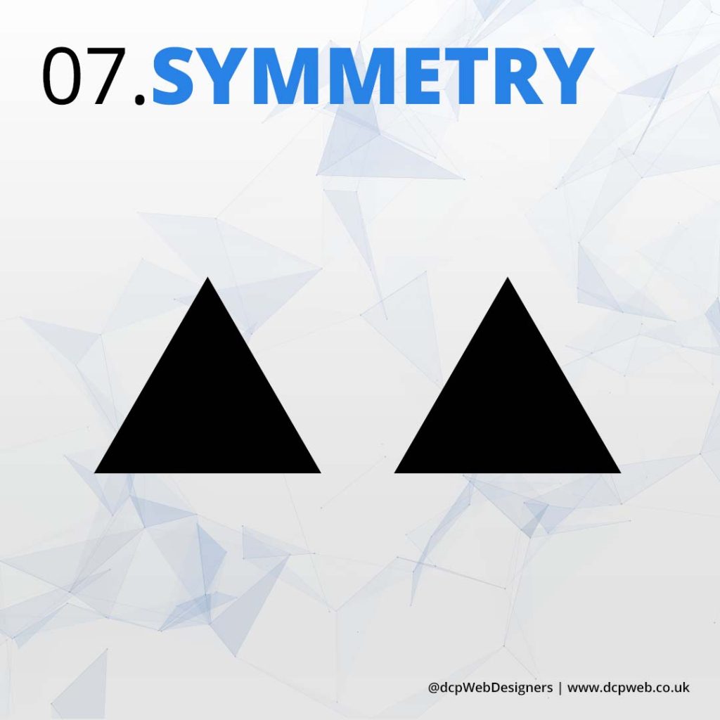
07. Symmetry
Symmetry creates harmony by evenly distributing elements around a central axis. It enhances balance, improves aesthetics, provides a sense of order, and makes designs feel more stable, professional, and visually pleasing.
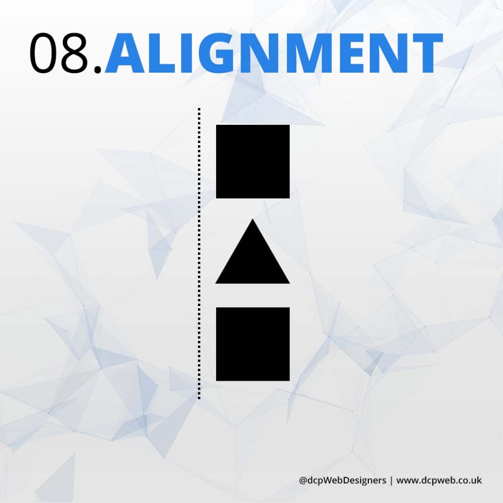
08. Alignment
Alignment ensures visual organisation by positioning elements correctly. It enhances readability, creates a structured layout, improves consistency, strengthens relationships between elements, and makes designs look clean, professional, and aesthetically cohesive.
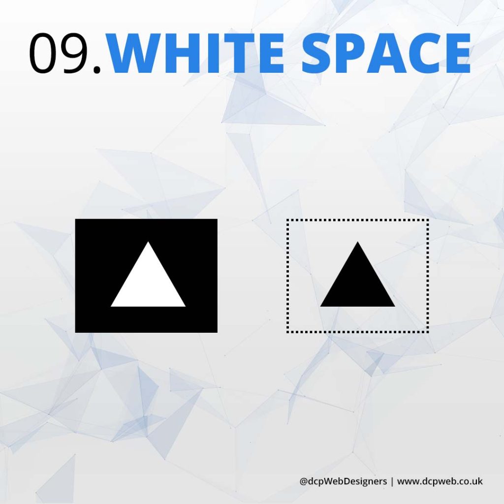
09. White Space
White space enhances readability by giving elements room to breathe. It improves focus, creates a clean layout, reduces visual clutter, strengthens hierarchy, and makes designs feel more elegant, professional, and visually appealing.
Did you find it helpful?
Conclusion
Mastering visual design principles is essential for creating compelling and effective designs. By applying contrast, repetition, proximity, scale, hierarchy, balance, symmetry, alignment, and white space, graphic and web designers can enhance aesthetics, improve usability, and guide user interaction.
These elements work together to create visually appealing, structured, and engaging designs that communicate messages clearly. Whether designing for print or digital platforms, understanding and implementing these principles will lead to more professional and impactful results.
Tell Us Your Thoughts
Do you want an amazing website?
Hi, I ‘m Pankaj Shah. My goal is to help your business grow by creating amazing websites!