
Enhancing accessibility in product design improves usability and inclusivity for all users. Keep it simple by using only one typeface, ensuring content clarity, and following a consistent colour palette.
Proper spacing enhances readability, while maintaining website design consistency creates a seamless experience. These quick tips will help you design more accessible and user-friendly products.

In this infographic post, we will outline some of the key elements to increase accessibility of your product design web pages.
Stick to only one typeface
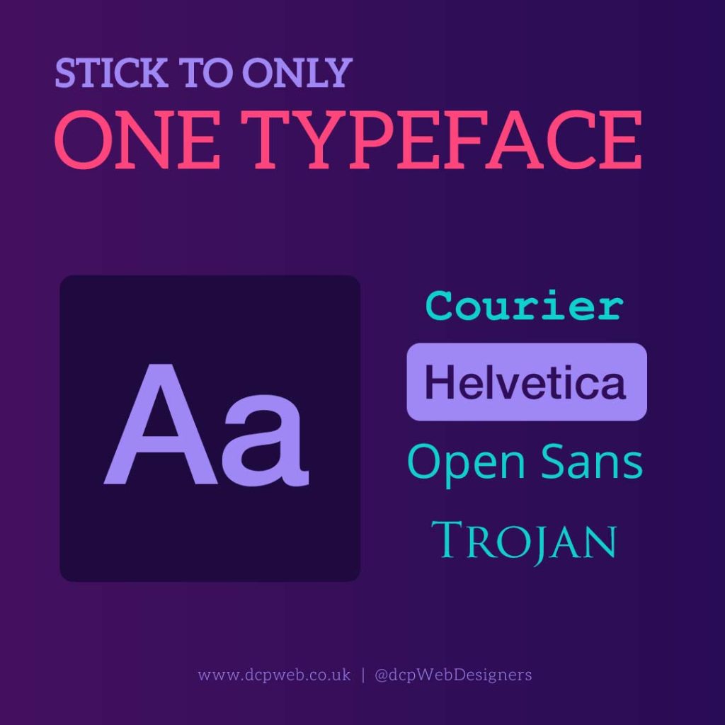
Using only one typeface in product design pages is crucial for accessibility and readability. Multiple typefaces can create visual clutter, making content harder to process, especially for users with dyslexia or cognitive impairments.
A single typeface ensures consistency, improving readability and navigation across the design. It also enhances brand recognition and maintains a professional, cohesive look. When too many fonts are used, users may struggle to differentiate important information, leading to confusion.
A well-chosen, legible typeface improves accessibility by making text clear and easy to read, ensuring a seamless and user-friendly experience for all individuals, including those with visual impairments.
The content must be clear

Clear content is essential for accessibility, ensuring that all users, including those with cognitive disabilities or language barriers, can easily understand the information presented.
Unclear or complex wording can create confusion, leading to frustration and misinterpretation. Simple, concise, and well-structured content improves readability, making it easier for users to engage with the product.
Using plain language, logical formatting, and avoiding jargon helps ensure inclusivity. Clear content also enhances user experience by providing straightforward instructions, improving navigation, and reducing errors.
By prioritising clarity, designers create more accessible and user-friendly products that cater to a diverse audience, enhancing usability for all.
Follow a colour palette
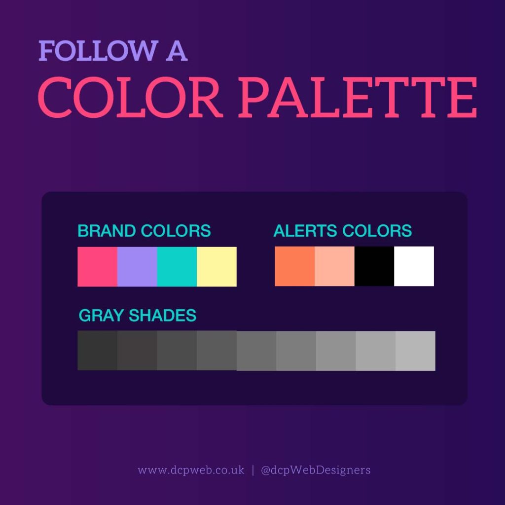
Following a colour palette is essential for accessibility and a cohesive user experience. A well-defined palette ensures visual harmony, preventing overwhelming or confusing designs.
Consistent colours improve brand recognition and make navigation intuitive. More importantly, accessibility guidelines, such as sufficient colour contrast, help users with visual impairments, including colour blindness, distinguish elements clearly.
A structured palette also enhances readability and usability, ensuring text and interactive components remain visible and easy to interact with.
By adhering to an accessible colour scheme, designers create inclusive products that cater to a wider audience, improving engagement and user satisfaction for all individuals.
Make use of spacing scale
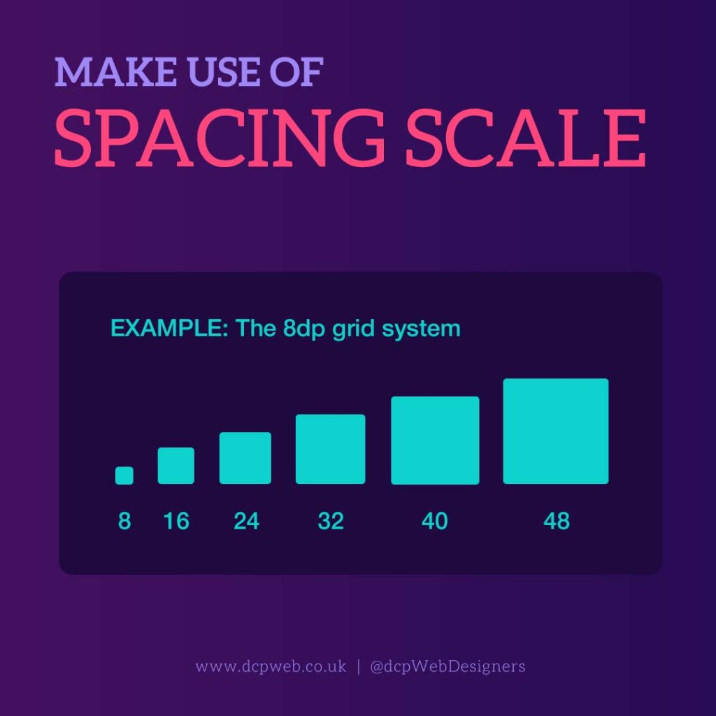
Using a spacing scale is crucial for accessibility and readability in product page design. Proper spacing enhances visual clarity, making content easier to read and interact with.
Consistent spacing between text, buttons, and other elements improves navigation, reducing cognitive load for users. For individuals with visual impairments or dyslexia, adequate spacing prevents text from appearing cluttered, enhancing comprehension. It also ensures touch targets are easily accessible on mobile devices, improving usability for all users.
A well-structured spacing scale creates a balanced layout, guiding the user’s eye naturally and providing a seamless experience that prioritises clarity, comfort, and accessibility.
Be consistent in designing styles
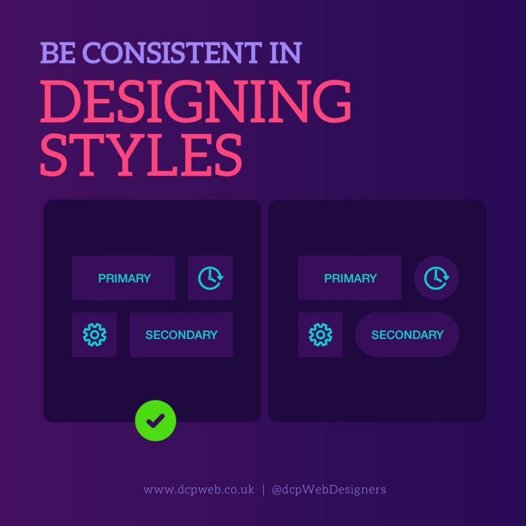
Consistency in design styles is essential for accessibility and a seamless user experience. A uniform approach to typography, colours, buttons, icons, and layouts ensures users can easily navigate and understand the interface.
Inconsistent design can create confusion, making it harder for users; especially those with cognitive impairments, to interact with the product effectively. Standardised styles establish familiarity, reducing the learning curve and improving usability.
Consistency also strengthens branding and professionalism, making the product visually appealing and trustworthy. By maintaining a cohesive design system, users can confidently engage with the product, leading to improved accessibility, efficiency, and overall satisfaction.
Conclusion
Enhancing accessibility in ecommerce product page design requires consistency, clarity, and thoughtful visual choices. Using a single typeface, clear content, a defined colour palette, proper spacing, and consistent design styles ensures a seamless, user-friendly experience.
These principles improve readability, usability, and inclusivity, making the product accessible to diverse users, including those with disabilities. Prioritising accessibility not only enhances engagement but also fosters trust and usability.
By implementing these best practices, designers create intuitive and inclusive products that benefit everyone. Accessibility isn’t just a design choice, it’s a necessity for improving user experience and ensuring equal access for all individuals.