
If you’re looking to build a business website that stands yet won’t break the bank, Elementor Pro is a game-changer. It combines easy-to-use design tools with professional-level customisation so you can create high-quality sites or hire experienced web developers to take your website to the next level. Even if you’re a web designer with years of experience or a business owner trying Elementor for the first time, a few expert moves will give you the edge.
Here, you’ll get real, practical tips straight from our expert WordPress web designers. Expect actionable advice for speeding up your workflow, boosting your site’s visual appeal, and squeezing every bit of performance out of Elementor Pro.
Dive in to learn exactly how to design, customise, and optimise websites that help your business shine online and deliver real results.

Mastering Workflow and Efficiency in Elementor Pro
Time is money, especially when building websites for clients or your own business. Luckily, Elementor Pro is chock-full of features aimed at helping you work smarter, not harder. Refining your workflow isn’t just about saving a few clicks, it’s about delivering polished work quicker, staying organised as projects get bigger, and keeping your branding on point across the whole site.
This section is all about the tools and habits that speed you up and keep your layouts consistent from start to finish. From dropping global widgets that keep all your calls-to-action looking sharp, to zipping around your designs with quick finder and keyboard shortcuts, Elementor puts most of the heavy lifting on autopilot if you let it.
The focus isn’t just on making things pretty, it’s about giving you reliable ways to manage big multi-page projects without losing your mind or sacrificing quality, our own website has over 1600 custom designed pages and Elementor Pro helps us set up workflows that speed up content creation.
We’ll dig into the most effective ways to reduce repeat work, stay agile, and keep your creative flow moving. If you want websites that not only look clean but work like a proper business showcase, these tips are your ticket.
Ready to shave hours off your build time while making every page look like it’s crafted by a pro? Let’s break it down below.
Save Time With Global Widgets and Reusable Elements
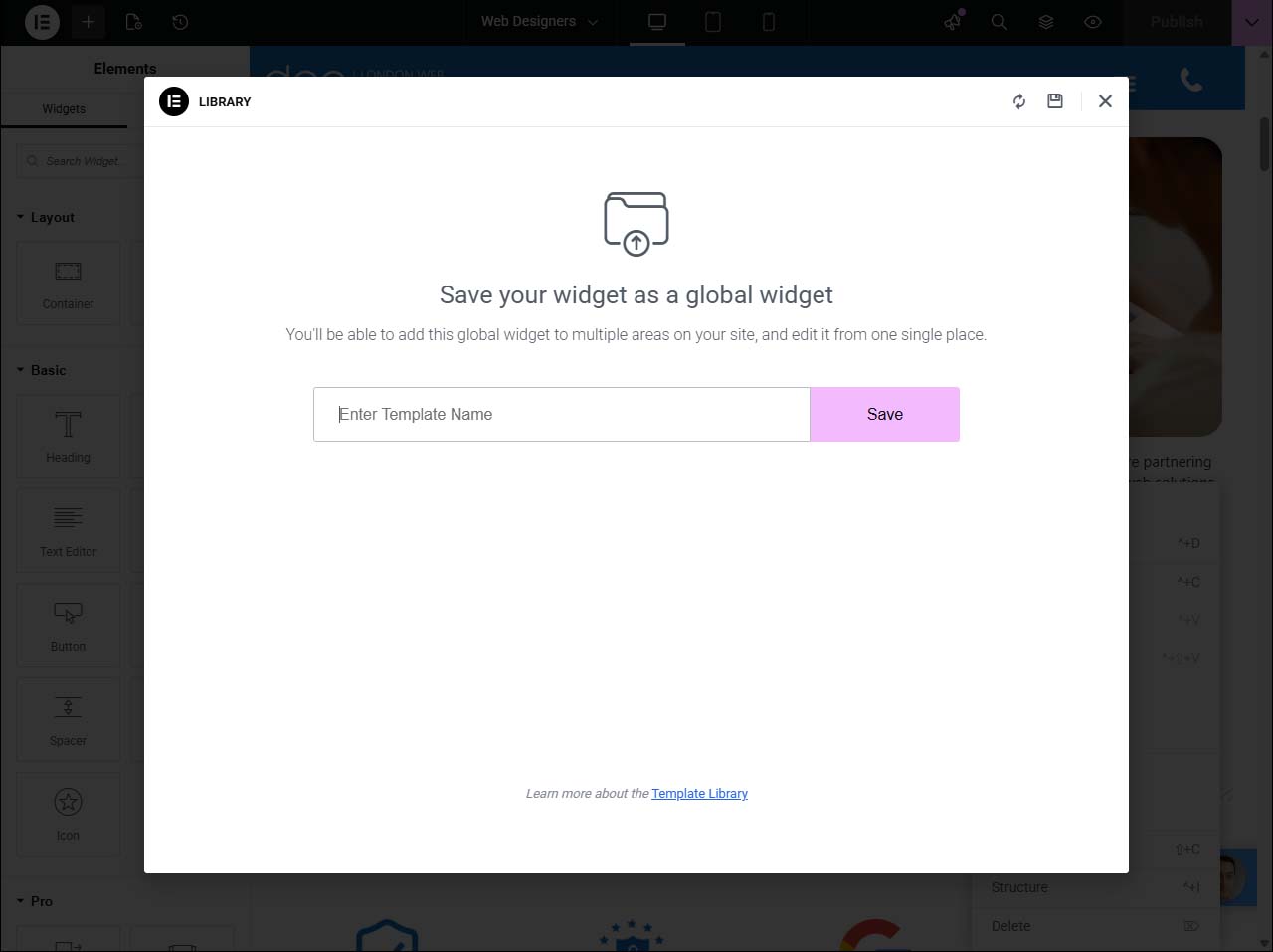
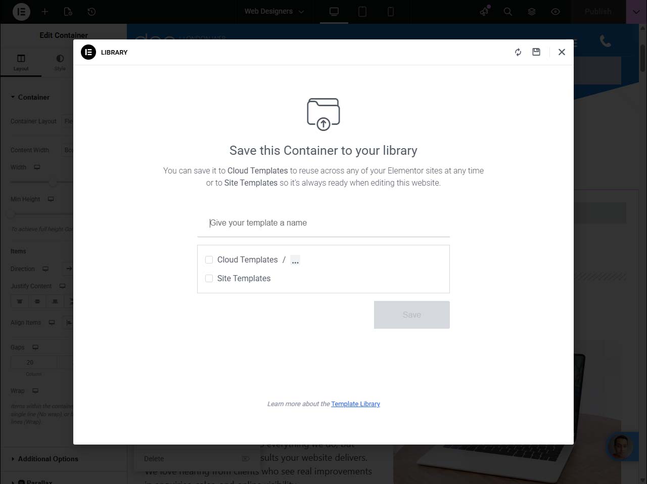
- Create a Global Widget: When you build a section like a contact form, testimonial, or call-to-action that will appear on multiple pages, don’t just copy and paste. Turn it into a global widget. Simply right-click the section or widget and select “Save as Global.” Now, you can drag that same element onto other pages in seconds, knowing they’ll all stay in sync.
- Edit Once, Update Everywhere: Global widgets are a massive time-saver for busy sites. If you tweak one global widget (change a phone number, colour, or offer), all pages using that widget update instantly. No more hunting around to fix minor details on every page. Just edit your global widget, save, and Elementor does the rest automatically.
- Keep Branding Consistent: From banners and CTAs to newsletter sign-ups, global widgets help your business maintain branding and messaging across your entire website. This means less risk of outdated info, mismatched designs, or embarrassing typos slipping through the cracks, it’s always up-to-date and on-brand, no matter how many pages you manage.
- Turn Sections Into Templates: For extra reusable power, save entire sections or blocks as templates within Elementor. These can be dropped into new pages as needed, then tweaked if you want a one-off change without affecting your global widgets. Perfect for team projects or client sites where consistency matters, but a bit of local customisation is useful.
- Collaborate Smoothly Across Teams: If you’re running an agency or working as part of a web design team, naming your global widgets clearly (e.g., “Homepage CTA Global”) and assigned category labels helps everyone stay organised. Combined with page templates, this makes hand-offs and future editing straightforward, even if the site grows to hundreds of pages.
Optimise Workflow Using Navigator and Quick Finder Tools
- Elementor Navigator: Navigator acts like a map for your page’s structure, making it easy to spot, select, and edit any element, even in crowded or layered designs. You can rename sections for clarity and quickly rearrange elements by dragging and dropping.
- Finder (Command/Ctrl + E): The Finder tool is your instant shortcut panel. Hit the keyboard shortcut, type what you need, like a page, template, or widget and jump straight to it without endless clicking through menus.
- Jump Between Pages and Templates: Switch quickly between different designs or site parts. Whether you’re editing a header or reviewing your 404 page, Finder and Navigator together make the whole editor much less of a maze.
Improve Workflow Efficiency With Keyboard Shortcuts
- Copy & Paste (Ctrl/Cmd + C/V): Copy widgets or entire sections and paste them around your site with familiar shortcuts, this is much faster than dragging elements from scratch.
- Undo & Redo (Ctrl/Cmd + Z/Y): Seamlessly step backwards or forwards through your changes if you make a mistake or want to test an idea. This gives you confidence to experiment without worry.
- Panel Preview (Ctrl/Cmd + P): Hide or show the Elementor interface, so you can see your page without any clutter. It’s an instant full-page view while you’re building.
- Switch Editor Views (Shift + Cmd/Ctrl + M): Jump between responsive views to test your design across desktop, tablet, and mobile with a single combination.
Advanced Typography and Visual Effects for Professional Design
A sharp-looking website draws people in, and first impressions count for UK businesses online. The right fonts, custom typography, and striking visual effects help shape that all-important professional image. With Elementor Pro, you’re not stuck with cookie-cutter styles; you can elevate your designs to truly reflect your brand and stand out from the crowd.
This section digs into the art of website style: how to use typography settings for rock-solid brand consistency, upload unique fonts that set your business apart, and bring content to life with motion and image effects. Think of these as your go-to moves for boosting engagement and adding flair, without wandering into over-the-top territory.
By mastering these visual tools, you’ll be able to create websites that not only look polished, but actually hold visitors’ attention, whether they’re browsing from their phone on the way to work or sitting at their desktop in the office. Let’s look at the building blocks of professional, engaging design done the Elementor way.
Set Up Default Fonts and Custom Typography Settings
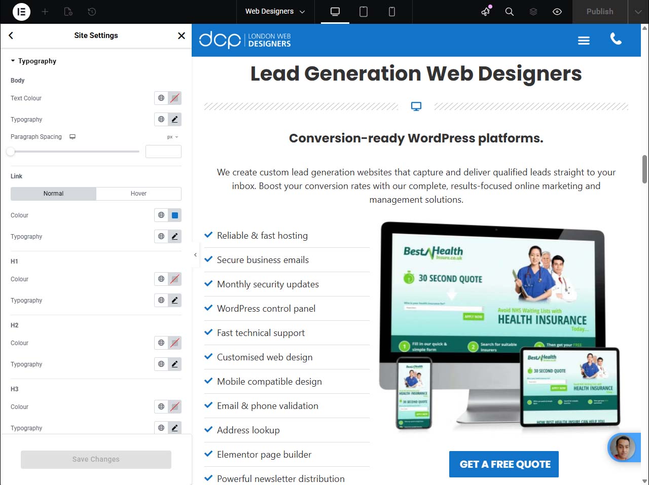
- Configure Global Typography Settings: Head to Site Settings in Elementor Pro, then select “Typography.” By setting default fonts, sizes, and styles for headings, body text, and buttons, you create a visual standard that instantly applies to all pages. No more tweaking font settings every time you add new content.
- Consistent Styles Across All Pages: Choose typefaces, font weights (like bold or light), and alignments that mirror your brand’s identity, whether formal or playful. When your text looks uniform throughout the website, it shows you’ve put thought into the details, which crucial for building trust with customers online.
- Adjust Responsive Typography: Elementor Pro allows you to specify font sizes for desktop, tablet, and mobile. This ensures headers are bold without eating the whole screen on a phone, and body text is readable for all audiences. Advanced controls like line height and letter spacing give even deeper control.
- Control Font Weights and Styles: Fine-tune things like italics, uppercase, underline, or font weight, so headlines can grab attention and body text remains easy on the eye. Use these sparingly to highlight key information while avoiding clutter or confusion.
- Save Typography as a Theme Style: Once your typing style is locked in, save it as a theme style for future projects. This is great for designers and agencies managing multiple sites, it’s quick to share the right “look” without rebuilding from scratch each time.
Upload Custom Fonts for Unique Business Branding
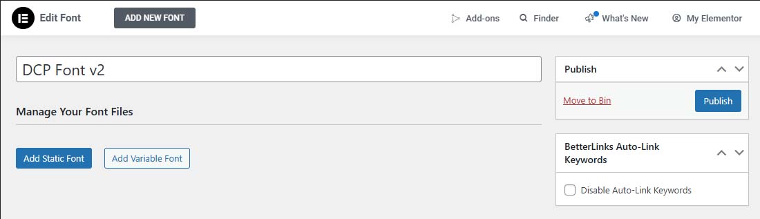
- Import Your Own Font Files: Upload .woff, .ttf, or .otf fonts directly into Elementor Pro under “Custom Fonts.” This means you can use any licensed font to truly match your business’s visual identity, no settling for the defaults.
- Preview and Assign Fonts: Once uploaded, preview how your custom fonts look in headlines or body text, and assign them to global blocks or specific site areas. This gives your entire website a signature style.
- Maintain Fast Load Times: Stick to a few custom fonts to keep your page speed up, multiple heavy font files can slow things down, so pick wisely for both impact and performance.
Make Your Pages Engaging With Entrance Animations
- Draw Attention to Key Content: Animate your hero headings, images or buttons so they fade in, slide, or zoom as users scroll. This highlights the most important sections of your site and gently directs the viewer’s focus.
- Choose Subtle, Professional Effects: Select from various animation styles inside Elementor, but keep transitions smooth for business sites. Too many wacky effects can be distracting, so pick one or two and use them consistently.
- Set Duration and Delay: Control both how long an animation lasts and when it starts. This way, elements appear naturally as visitors scroll, rather than all at once or too soon. Test on mobile and desktop to make sure the effect fits all screens.
Enhance Your Design With Shape Dividers and Image Filters
- Add Shape Dividers for Modern Section Breaks: Elementor Pro lets you drop in shape dividers (tops or bottoms) between sections for a smooth or wavy transition, rather than harsh straight lines. Pick from tall peaks, curves, or angled shapes to match your brand energy and add subtle depth to your layout.
- Customise Divider Settings: You can flip dividers horizontally, adjust their width and height, or layer multiple dividers for a unique look. Add background colours or gradients to these shapes for extra flair, enough to separate content without losing site unity.
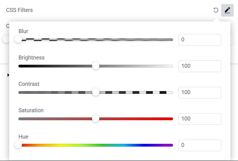
- Apply CSS Image Filters: Use Elementor’s built-in image filters to tweak brightness, contrast, saturation, or blur images, bringing them in line with your brand palette. This way, photographs and icons feel like they “belong,” even if shot on different days or cameras.
- Enhance Branding and Accessibility: Filters can also boost readability and help maintain visual contrast for accessibility. For example, if your image is too bright, a quick filter can tone it down behind white text, so users with low vision aren’t left out.
- Combine Effects Thoughtfully: Pair shape dividers and image filters for visual variety, but don’t go wild. A touch of shape and subtle filtering can breathe life into a layout, but your message should always come first.
Create Dynamic and Responsive Pages With Elementor Pro


In today’s tech-driven world, you can bet visitors will view your website on screens of every size. Whether your customers are browsing on their desktops at work, scrolling on mobiles during their morning commute, or flipping between tablet and phone while shopping, your site needs to look sharp and function perfectly on every device.
This section explores how Elementor Pro arms you with the right tools to keep pages flexible and visually appealing, no matter the screen size. You’ll learn about the power of the theme builder for seamless site-wide templates, insert dynamic content for more personalisation, and adjust layouts quickly for smooth mobile navigation.
A responsive, dynamic website does more than just look modern, it improves your site’s usability and keeps customers engaged from the first click. Get ready to learn the secrets of crafting pages that pop on every device and give you a true competitive edge in the UK business scene.
Design With Theme Builder and Add Dynamic Content
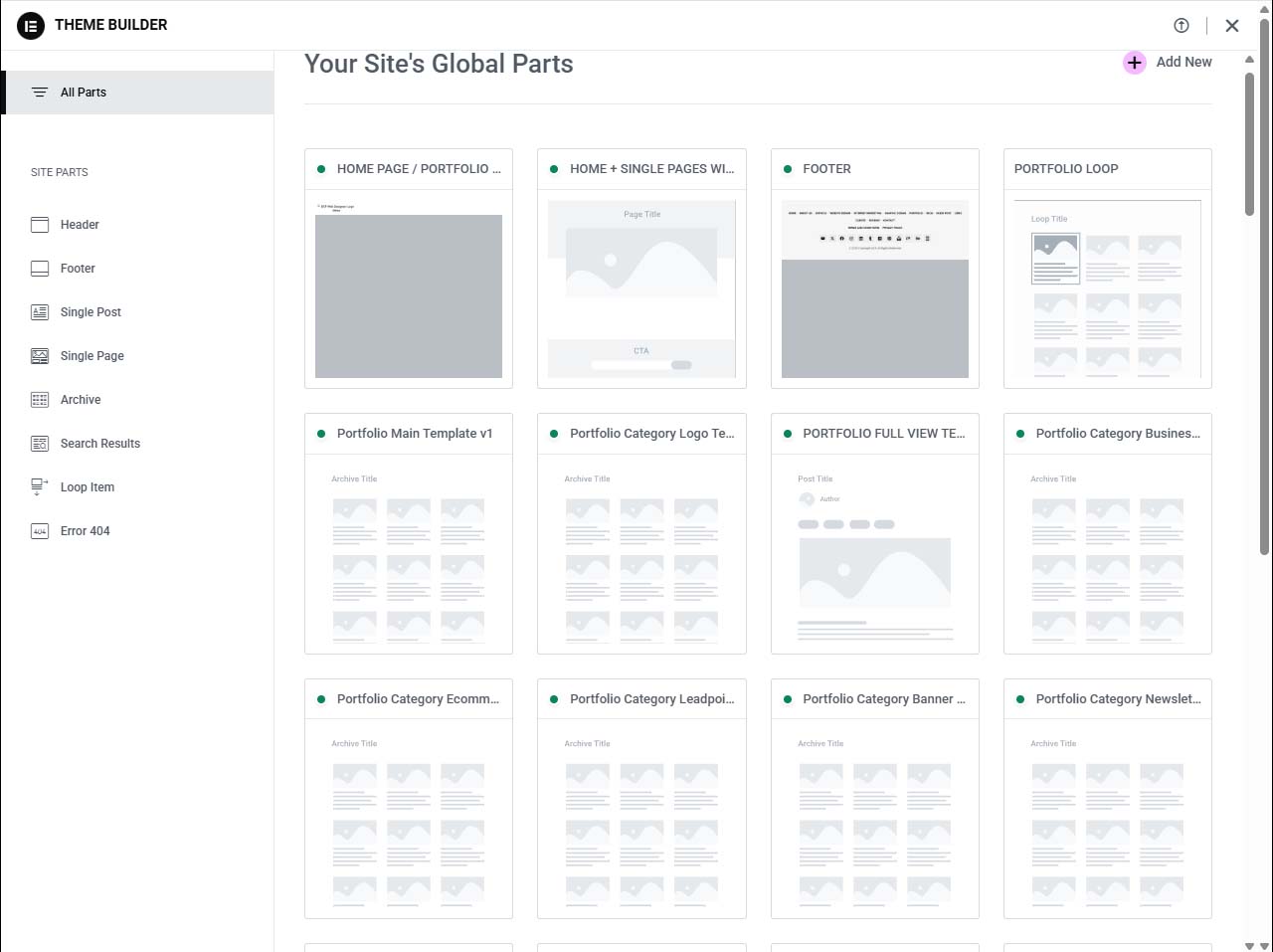
- Use the Theme Builder to Create Universal Templates: Elementor’s theme builder lets you design headers, footers, blog archives, and product pages as reusable templates. This saves time and guarantees consistent branding across your entire site. Change your menu in one spot, and every page updates instantly.
- Add Dynamic Content Widgets: Drop in dynamic fields like post author, date, or custom WooCommerce properties (e.g., live stock levels or price). These widgets automatically show updated info for each post or product, giving your website a real-time, bespoke feel.
- Personalise the User Experience: Dynamically display content based on user login status, membership, or purchase history, perfect for delivering exclusive offers or member content. Elementor’s integration with custom fields and ACF plugins makes this a breeze.
- Design Once, Apply Everywhere: Update a template, and it propagates to every page or post using it, ideal for agencies or shops that manage lots of content. No more repetitive changes page by page.
- Keep the Structure Clean for Collaboration: If you’re building as a team, agree on template naming conventions and logical structures. It’ll save headaches for everyone when another designer jumps in or for easy client handover.
Optimise Your Site for Mobile With Sticky Header Options
- Enable Sticky Header on Mobiles and Tablets: Keep your main navigation or logo visible as users scroll using Elementor’s sticky header option. It’s easy to set for desktop, tablet, or mobile views individually, so your menu doesn’t hog precious screen space where it shouldn’t.
- Adjust Viewport Settings: Fine-tune how and when the sticky header appears: only after users scroll a certain distance, or only on downward scrolling. These tweaks make for a smoother UX on touch devices.
- Tailor Padding and Font Size Per Device: Reduce header padding and icons on mobile, and bump up touch targets for easy finger navigation. Elementor gives you total control over each device, so nothing overlaps or looks cramped.
- Check Responsiveness in Real Time: Preview your changes for each device inside Elementor, making immediate adjustments until everything lines up perfectly. This is the quickest way to catch little layout shifts before your audience does.
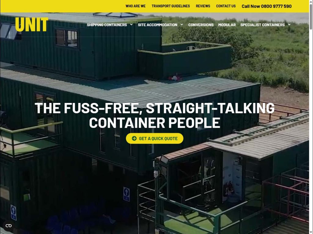
Craft High-Impact Hero Sections With Optimised Landing Pages


- Start With Pre-Designed Templates: Elementor’s template library offers polished hero sections and landing page designs to get you up and running. These are conversion-focused and professionally styled, making them a solid jumping-off point for any campaign.
- Feature Bold Headlines and Engaging Visuals: Don’t bury the lead, highlight your unique selling points right at the top with eye-catching photos, big headlines, and supporting taglines. Use Elementor’s padding and alignment controls to ensure everything is visually balanced.
- Drop in Strong Calls to Action: Make sure your landing page tells the visitor exactly what to do next, whether it’s filling in a form, clicking to buy, or calling your business. Place buttons where they’re easy to spot and click, and test colours that match your brand identity for consistency and trust.
Expand Website Functionality With Popups, Forms, and Integrations

There’s more to a winning business website than just looks, you also need to capture leads, talk to customers, and measure results. Elementor Pro brings those marketing tools directly into your site builder, so you can roll out sleek popups, high-performance forms, and integrations with analytics in just a few clicks.
Whether you’re running a local shop or a national brand, interactive elements play a big role in engaging visitors and growing your audience. This section covers how to tap into Elementor Pro’s powerful popup builder, get more out of every form submission, and track your site’s performance for continuous improvement.
Smart use of popups, forms, and data tracking lets you actively shape your business’s future, by learning what your customers care about, refining your offers, and doubling down on what works. Let’s see how it comes together inside Elementor Pro.
Create Targeted Popups Using Conditional Visibility Rules
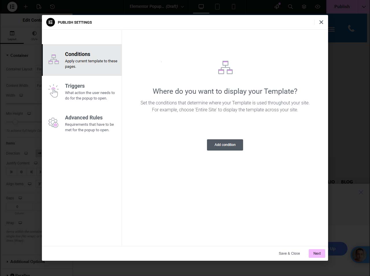
- Build Custom Popups Tailored to Your Brand: With Elementor’s popup builder, you can design everything from newsletter sign-ups and promotional messages to exit-intent popups, no coding needed. Complete control over layouts, colours, and animations keeps things on brand.
- Set Trigger Rules for Maximum Impact: Choose exactly when each popup appears: after a time delay, on scroll, at exit intent, or when a button is clicked. This ensures your message reaches visitors at the optimal moment, increasing sign-ups and conversions.
- Use Conditional Visibility for Targeted Messages: Display popups only on specific pages, to visitors from certain regions, or for returning users. Setting rules for visibility means no irrelevant or repetitive popups, for a smoother user experience.
- Collect and Segment Data: Design forms inside your popups that collect email addresses, feedback, or survey answers. Elementor lets you segment these contacts for later use in your marketing, right from the start.
- Stay Compliant with Privacy Laws: Add consent checkboxes and clear privacy messages to your popups to keep your website aligned with GDPR and other UK data regulations. Customers notice this kind of professionalism, and it builds trust.
Integrate Forms and Connect Google Analytics for Better Insights
- Create Forms With Built-In Builder: Use Elementor’s form widget to build everything from contact forms to application submissions, with fields for text, selection, dates, uploads, you name it. Drag-and-drop editing makes it all quick and hassle-free.
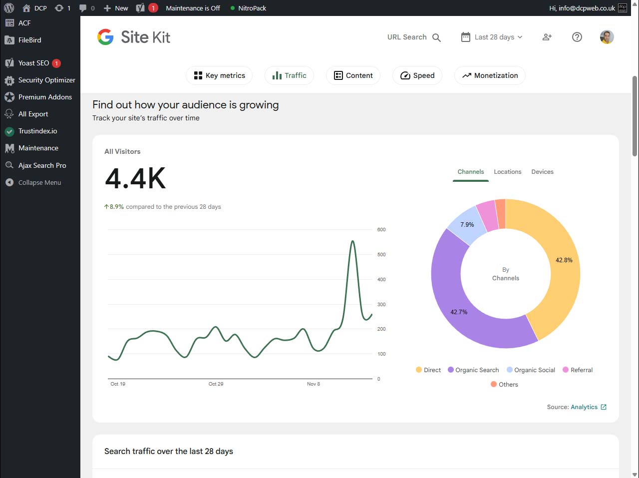
- Connect With Google Analytics: After setting up your form submissions, link them to Google Analytics or tag manager. You’ll be able to see how users reach your forms and which ones convert best, making future tweaks smarter and more informed.
- Automate Workflows With Integrations: Send form messages directly to your preferred CRM, email autoresponder, or Slack channel, no manual entry needed. This saves your team time and improves the quality of your customer data.
- Track, Test, and Refine: Regularly review analytics data on user submissions and engagement. Use these insights to adjust questions, add new fields, or tweak your calls-to-action, so your forms keep working harder for you.
Enhance Websites With Advanced Features and Addons
When it’s time to take your Elementor site from “solid” to “sensational,” advanced features and reliable addons make all the difference. These tools allow you to layer on unique effects, integrate third-party widgets, and exercise total creative control, without sacrificing website speed or usability.
In this section, you’ll discover how to spice up your site with subtle (or bold) parallax scrolling, dynamic video backgrounds, and lazy loading for smoother performance. Plus, see how custom CSS and dynamic shortcodes open the door to precise customisation, while premium addons like Ultimate Addons and Crocoblock unlock features you won’t find in core Elementor Pro.
With the right mix of effects and enhancements, your business website can break out from the pack and truly wow every visitor. Let’s dig into these power tools below.
Add Parallax Effects, Video Backgrounds, and Lazy Loading
- Apply Parallax Scrolling for Multi-Layered Depth: Give your site a sense of movement as visitors scroll by enabling parallax background effects in Elementor’s section settings. Layers move at different speeds, creating a dynamic, modern look that adds instant polish to landing pages or key blocks.
- Insert Video Backgrounds for Visual Impact: Instead of static images, drop in looping video backgrounds behind headlines and call-outs, perfect for creative businesses, services, or portfolio sites. Just make sure to compress videos and offer fallback images for mobile devices to keep loading quick.
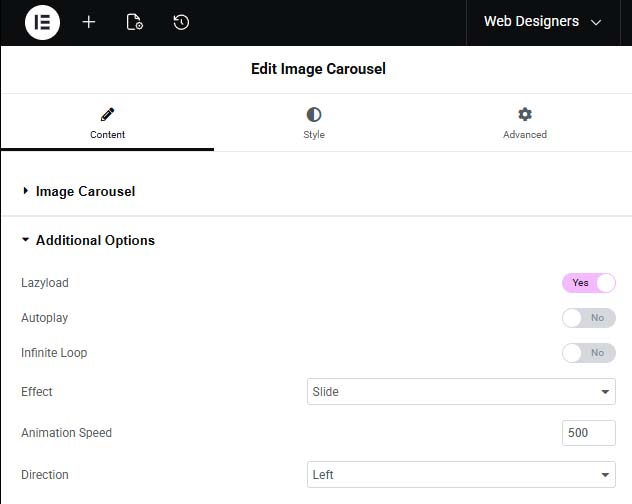
- Enable Lazy Loading for Speed: Turn on lazy loading for images and videos to prevent all heavy media from loading at once. This cuts initial load times, improves Google PageSpeed scores, and keeps users engaged with a snappy, responsive experience.
- Balance Effects With Performance: It’s tempting to layer on every animation going, but always balance interactivity with usability. Parallax and background video work best as accents, not distractions. Make sure every extra feature serves a clear business goal.
- Test Across Devices and Browsers: Check your new effects on phone, tablet, and desktop to ensure smooth operation everywhere. Browser quirks and device limitations sometimes require a few tweaks, so your slick effects don’t vanish for a chunk of your audience.
Take Full Control With Custom CSS and Dynamic Shortcodes
- Inject Custom CSS: Add style tweaks to individual sections, widgets, or across your site with Elementor Pro’s custom CSS box. Change margins, create hover animations, or implement unique brand details that aren’t in the default settings.
- Embed Dynamic Shortcodes: Drop in shortcodes from WooCommerce, contact forms, or booking plugins directly into Elementor sections. It’s an easy way to present advanced features exactly where you want them without extra coding.
- Test and Document Custom Changes: Keep notes or usage comments in your CSS, especially for team environments or client hand-offs. This helps everyone understand what each custom tweak does, reducing confusion on later edits.
Extend Elementor Pro With Premium Addons and Widgets
- Ultimate Addons for Elementor: Expands your toolbox with dozens of new widgets—think info boxes, advanced post grids, fancy sliders, and interactive timelines. Great for agencies or freelancers needing lots of design variety.
- Crocoblock Suite: A full stack of plugins including JetPlugins, Crocoblock unlocks dynamic content, booking systems, advanced menus, and filtering for WooCommerce sites. It’s the go-to for e-commerce or multi-functional business sites.
- Essential Addons and Elements Kit: Both of these offer handy widgets for testimonials, advanced Google Maps, and animated headlines, plus many layout extensions. They play nicely with Elementor Pro and don’t weigh your site down.
- Element Pack Pro and The Plus Addons: If you want niche widgets (reviews sliders, pricing tables, social feeds) or layout jazz-ups, look here. They’re regularly updated and good for designers looking to cut down on custom code.
Optimising Performance and SEO With Elementor Pro

It’s all well and good having a brilliant design, but none of it matters if your website takes ages to load or never shows up in Google. Visitors in the UK expect sites that are fast, easy to find, and keep all their info up to date, the slightest lag or missing link is enough to lose trust.
This section zooms in on how to optimise your Elementor site for speed and search engines. You’ll see how performance settings, SEO plugins, and pre-built site kits help you meet technical standards and local customer expectations. It’s what keeps your site firing on all cylinders long after launch day.
Smart optimisation is a must for modern business websites. Let’s uncover the top tricks to boost your rank and keep visitors engaged, all within Elementor Pro’s slick ecosystem.
Boost SEO With Yoast and Advanced On-Page Optimisation
- Integrate Yoast SEO for Structured Content: Yoast SEO works seamlessly with Elementor, letting you optimise meta titles and descriptions directly inside your page editor. This gives you instant feedback on keyword usage and readability, all from the same dashboard.
- Optimise Heading Hierarchies and Structure: Use Elementor’s heading widgets purposefully, H1s for page titles, H2s for key sections, and so on. Proper structure helps search engines understand your content and boosts your site’s rank for relevant UK searches.
- Add Image Alt Tags and Descriptions: Always write meaningful alt text for images and graphics. Both Yoast and Elementor nudge you to do this, improving accessibility and giving your images a fighting chance in Google’s image search results.
- Use Google Analytics for Data-Driven Adjustments: Connect your site with Google Analytics to keep tabs on which pages perform, bounce rates, and visitor paths. Use this info to refine content, spot SEO gaps, and focus future edits where they’ll count most.
- Check Internal Linking and Site Maps: Make sure your website structure is logical, links between pages, a sitemap.xml, and a robots.txt file set up right. Solid linking boosts SEO and helps users (and Google) find what they’re looking for in fewer clicks.
Speed Up Your Site With Elementor Performance Tools and Site Kits
- Enable Asset Minification and Compression: Flip the switches in performance settings to shrink CSS and JavaScript files. This trims page bloat and keeps site loading fast for everyone, everywhere.
- Use Site Kits for Quick Deployment: Elementor’s pre-built site kits, full sets of templates, let you launch new sites or sections quickly without starting from a blank canvas. It’s a time-saver and ensures consistent performance standards.
- Leverage the Template Library: Save and reuse template blocks for repeat elements (like testimonials, banners, or product layouts). This speeds up design time and reduces potential code conflicts or duplicate content that can slow you down.
- Regular Cache Clear-Outs: Enable and periodically clear your caching plugins to keep delivering up-to-date CSS files and prevent display bugs for returning users. Automated cache clearing keeps maintenance simple and performance sharp.
Design Navigation and Engaging Interactive Elements

If you want your website visitors to stick around and actually take action, clear navigation and interactive touches are a must-have. With Elementor Pro, you’re not locked into plain dropdown menus or cookie-cutter navigation, you’ve got a toolkit fit for polished mega menus, smooth anchor links, and branded headers to guide users all the way through.
This section breaks down how to take your menus, footers, and 404 pages from “will do” to “look at that!” With the right touches, you make it easier for visitors to find what they need, keep your brand front-and-centre, and gently guide lost users back to the main action.
Putting in the extra effort here helps turn curious browsers into loyal customers, and makes site management easier as your business grows. Let’s see how Elementor makes your navigation as strong as the rest of your site.
Create Advanced Menus, Mega Menus, and Anchor Links
- Build Draggable Navigation Menus: Elementor lets you create navigation bars you can move and position easily on your page header, side, anywhere. Great for one-page websites or creative layouts, it lets users jump to the right content with minimal fuss.
- Design Mega Menus for Complex Sites: For service providers, e-commerce, or large blogs, a classic dropdown won’t cut it. Use Elementor or premium addons to create mega menus with columns, images, and featured sections, everything neatly grouped for fast browsing.
- Use Anchor Links for Smooth Scrolling: Insert anchor points in any section and link your menu buttons to these spots. Visitors can zip between sections with a click, crucial for landing pages or long-form sales content where you want to control their journey.
- Fine-Tune Menu Styles and Interactions: Adjust hover animations, colours, and mobile layouts (think hamburger menus or slide-outs) so your site navigation is visually matched to your brand and works just as well for thumb-tapping mobile users as for desktop visitors.
- Test User Experience and Accessibility : Check your navigation works with keyboard shortcuts, screen readers, and all device types. Clear navigation isn’t just good for SEO, it’s essential for accessibility and overall satisfaction, too.
Customise Headers, Footers, and 404 Pages Like a Pro
- Quickly Brand Your Headers and Footers: Use Elementor’s theme builder or template library to craft headers and footers that match your colours, logo, and message. Lock down template changes to prevent unwanted edits for confident client handover.
- Set Up Helpful 404 Pages: Create custom 404 error pages that suggest popular links, search bars, or a clear way back to key site areas. This keeps lost users engaged rather than bouncing away for good.
- Ensure Site-Wide Consistency: Apply your templates universally for a professional, congruent look from top to bottom, and make tweaks in one spot that update across the whole site. This saves time and supports clear, reliable navigation for everyone.
Summary
Elementor Pro makes it easy to build a high-quality business website without overspending. Whether you’re an experienced designer or a beginner, the right techniques can dramatically improve your results. In this guide, our expert WordPress designers share practical tips to streamline your workflow, enhance your site’s design, and maximise performance. Learn how to design, customise, and optimise Elementor Pro websites that stand out online and generate real business impact.

